Welcome

Welcome To My Media Blog

Wednesday, 20 April 2011

Evaluation: Question 4 How did you use media technologies in the construction and research, planning and evaluation stages?


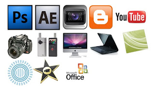
Adobe Photoshop: I used Photoshop to design my film magazine and poster, I also used the software to create the logo’s for the production companies and the titles between scenes in the trailer. I believe Photoshop was the best software to use for the tasks I had to complete as it enables amateurs to produce very high quality professional looking products, also certain tools on Photoshop were needed to create the 3-D image on my magazine cover.

Adobe After Effects (AAE): I used AAE to create the “Captive” and “Coming Soon” titles in our trailer. I chose to use AAE to design the titles as in my opinion it is the best product on the market in regards to making professional looking titles and amateur CGI.

Sony Vegas: I used Sony Vegas to edit the trailer. I chose Sony Vegas to edit the trailer due to the fact that I own a pc and I believe that it is the best software available for the windows operating system.

Blogger: I used blogger to document my planning and research over the complete process from pre to post production on all of the products I have made.

YouTube: I used YouTube to upload drafts of the trailer and any other videos relating to the research and planning process. I used YouTube rather than other video uploading sites such as Vimeo as the site has a higher user base and activity on the site therefore giving me a better chance to gain feedback from the YouTube community.

Canon SLR: I used the Canon SLR camera to get any photographs needed for my magazine and poster. I used the SLR due to it high image quality therefore making my products look as professional as possible.

Flip Mino HD Video Camera: I used the Flip to film all of the scenes we needed for the trailer. I used the Flip as it captures 720p HD video rather than the standard definition cameras available at college.

Apple iMac & Dell Inspiron: I used the Mac and the Dell laptop to carry out generic tasks such as blogging and software use.

Camtasia: I used Camtasia to capture my screen for my evaluation questions such as this.

Presi: I used Presi to compose a presentation for my publication plan. I used Presi rather than Powerpoint as it provides a more professional looking presentation.

iMovie: I used iMovie to compose the sound for the trailer from the stock sounds in the iMovie library.

Microsoft Office Programs: I used Exel Word and Powerpoint for generic production documents such as actor release forms.


Friday, 15 April 2011

Thursday, 10 February 2011


Here is the rough draft of our teaser trailer. After reviewing it we have decided that numerous changes need to be made and they will be made soon.

Wednesday, 9 February 2011

Planning & Research: Print Screen Of Poster In Progress 2

Here I have added the masthead and 2 images within the shape of a brush stroke to give the poster an edge. I intend to make the poster minimal to give it more of a teaser feel rather than a standard film poster.

Planning & Research: Print Screen Of Poster In Progress

I used an image of the main character looking over his shoulder in a suspicous way and gave the image darker tones and a blue/cyan tinge to make the image more effective.

Planning & Research: Print Screen Of Magazine In Progress 2

Here all I have done is added a few brushes to the texture in the background and added the main image I believe it improves the magazine vastly and therefore believe it needs to be uploaded.

Planning & Research: Print Screen Of Magazine In Progress


Here is the new and in my opinion improved layout for my film magazine. I have taken the feedback that I received on my earlier post and decided to act upon the changes that needed to be made, whilst doing so I was inspired by the "EMPIRE" Capetian America cover and therefore decided to restart my magazine and attempt to recreate a cover with a similar layout to the "EMPIRE" cover.

Tuesday, 1 February 2011

Planning & Research - Magazine Feedback Review


After reading through the feedback left on my unfinished magazine I have come to the conclusion that although the feedback is mostly positive a number of changes are needed to make my magazine cover the best it can be.

Firstly I am going to rearrange the text on the left hand side of the image to make the magazine look more conventional and aesthetically pleasing. I will also add other pictures and sub headings to the cover to give the magazine a more complete and professional look.

Thursday, 27 January 2011

Planning & Research - Photographs For Poster And Magazine


Here are just three images of the numerous photographs we took whilst filming to use on my poster and magazine cover I will upload the original images I use on my final poster and magazine on a later date.

Thursday, 20 January 2011

Planning & Research - Film Magazine Masthead Ideas Evaluation

Due to technical difficulties I have had to evaluate the masthead ideas I posted on a separate post. I have decided that I shall use a font similar to the two lower ideas as the fonts are simpler and give the masthead a more conventional look.

Planning & Research: Film Magazine Masthead Ideas

Friday, 14 January 2011

Planning & Research - Production Company Names

As we have to produce our own production company logo and name I have narrowed my ideas down to 2 favourites and will decide on which one to use soon. The 2 names are:

  • Flashback Films
  • Fastforward Films
I think that the aliteration 2 F's works really well both aesthetically aswell as when spoken.

Monday, 3 January 2011

Planning & Research - Week Plan

Over this week I plan to edit a rough cut of the teaser trailer using the footage we have shot over the recent weeks. I plan to edit the rough cut to a high standard leaving less editing to do at a later date and to gain a realistic sense of what the audience may think about the final trailer. I shall also produce rough copies of my film magazine and poster on adobe photoshop to the same standard of the rough cut for the reasons I mentioned above.